16 industry website designs that will inspire you
A website is often a construction company’s first impression. These ones nailed it.
The days of flipping through a phonebook to find a contractor, architect or engineer are over. Most likely, someone’s first impression of your company will be from an internet search.
Is your website communicating your brand and your values?
We sniffed around cyberspace and rounded up some websites that we believe tell their company story particularly well through images, design and text. Here they are in no particular order.
Low Tide Properties
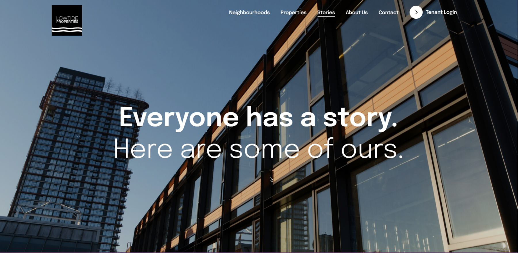
Sleek, clean and modern, the site features slick animations. Nope, they aren’t a tech company, but at first glance you might think so. Their copy puts it this way “Technically, we’re people who work in real estate. But we’re not real estate people”.
DIRTT
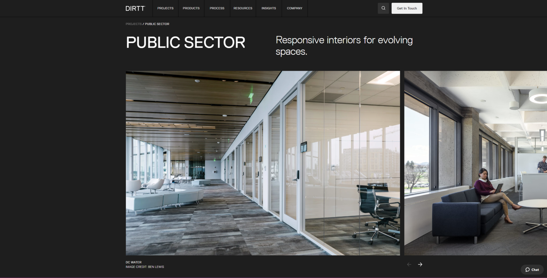
Beautiful photography is the star of DIRTT’s website. It has a seemingly endless supply of it. One of their brand plays is that images have one single rounded corner, sometimes this happens on hover, leading to a truly unique website. It also features some orange accent colours but it never overstays its welcome.
Pomerleau
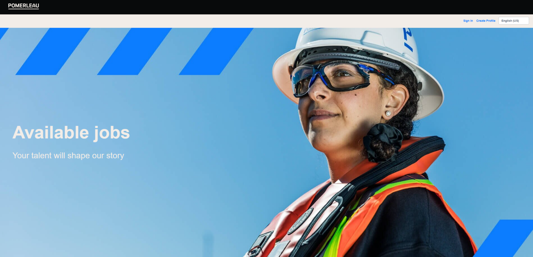
With headers like “Your talent will shape our history”, and the sheer amount of careers related pages, this is a company with a strong website-based talent recruitment strategy. And with their flashy blues and quick animations, you can’t help but feel this is an energetic, exciting place to work. With its mostly inverted colour scheme – dark backgrounds and white text – this is a website that really pops.
Ingenuity
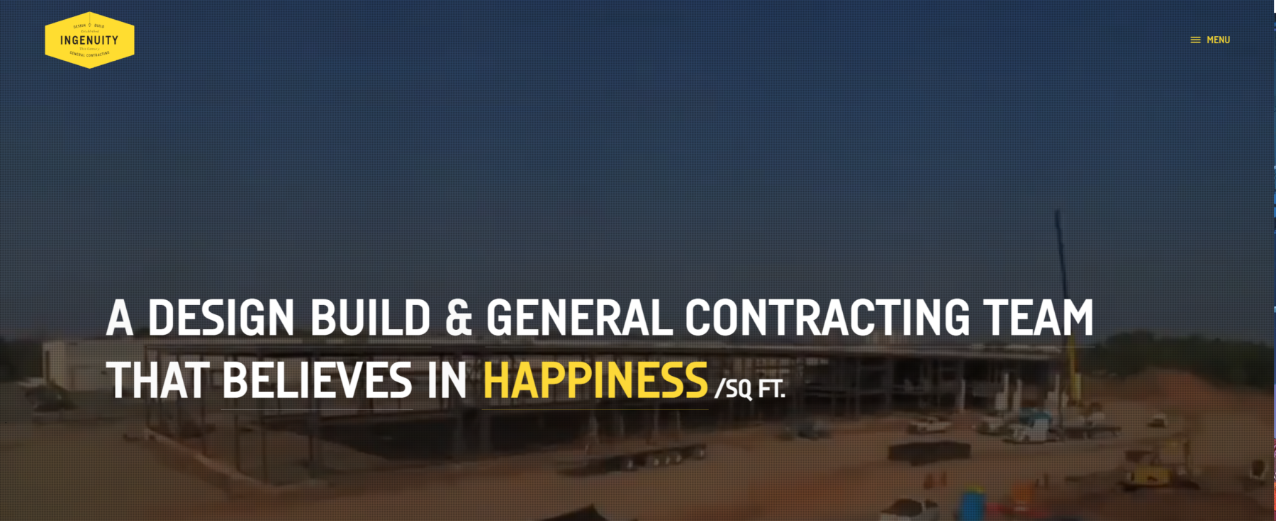
This site main header cleverly flips between words like “happiness”, “detail”, “productivity”, “creativity” and more to tell the brand’s story. The perfectly curated yellow pops over darker colours. The stamp logo, combined with black and white photography, communicates a classic feel that suggests experience.
Zeidler
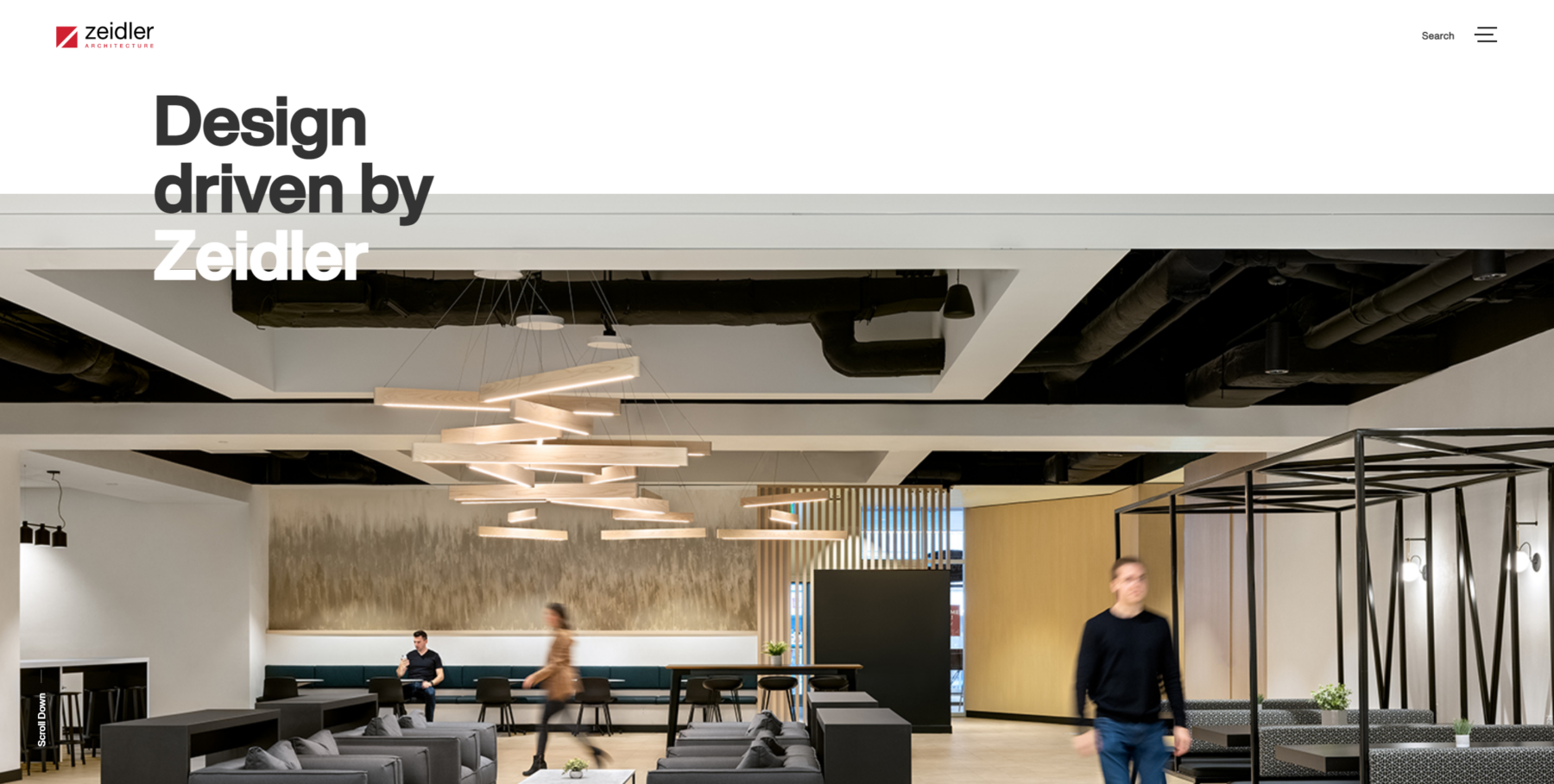
The headers in Zeidler’s site half float over imagery and backgrounds, pulling different sections together. The attractive red branding is used strategically as an accent colour throughout the site. You can definitely see the influence of Apple design with the clean Helvetica fonts over white backgrounds. Everything feels intentional and curated – the highlighted projects, photography and the copy.
Chandos
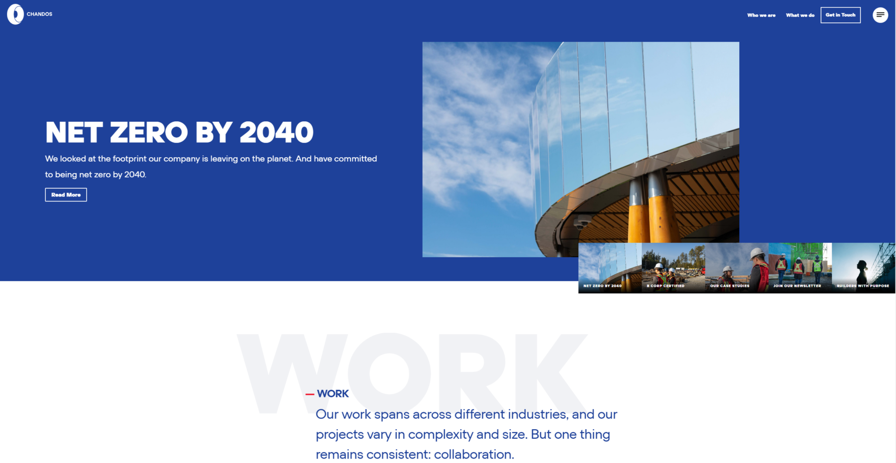
It’s big, it’s bold and not shy about sharing. Chandos immediately shows off its B Corp certification and commitment to be net zero by 2040. While red and blue colours are old hat for many companies, they make it feel new with modern flourishes. The navigation is clean, focused and simple, despite the site actually being much larger than it seems.
Scott Construction Group
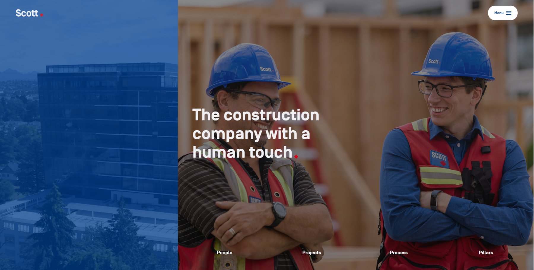
Scott’s tagline says it all: “The construction company with a human touch.” The animated pen markings make it feel like someone carefully went over all the content, guiding and pulling the viewer’s eye. The company’s diamond logo shape is utilized creatively in buttons and to punctuate messages. The company’s focus on people went a step further recently, when it achieved B Corp certification.
EllisDon
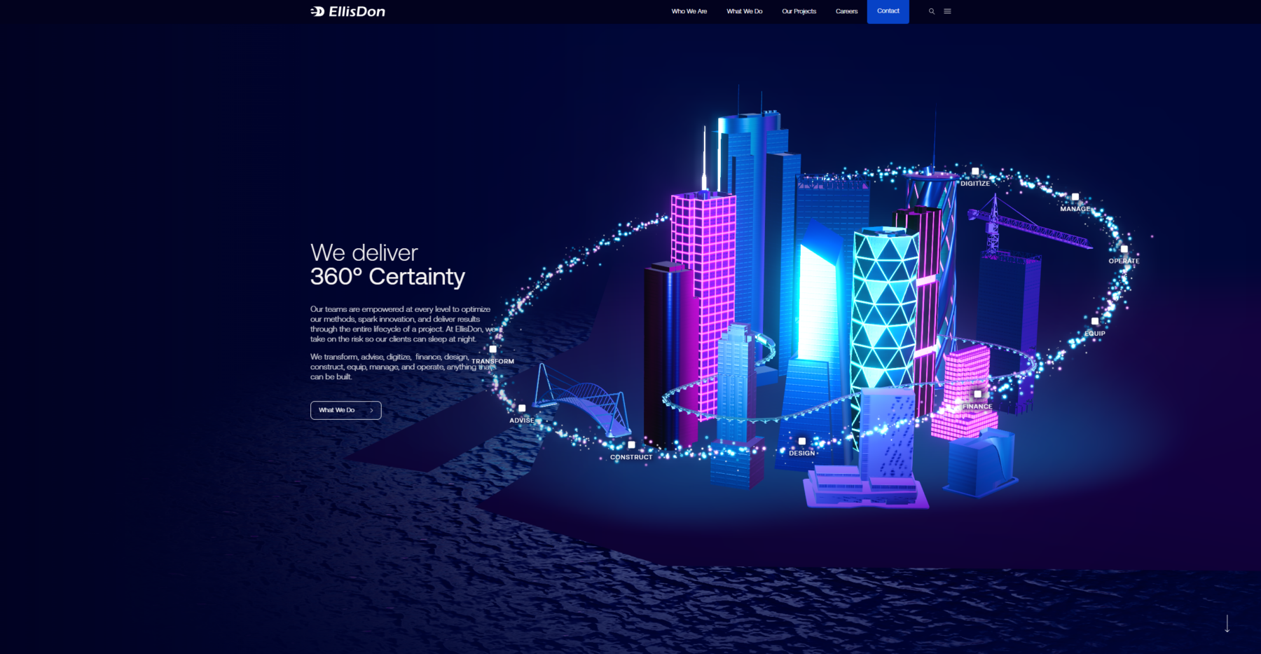
3D interactive graphics set this one apart from others in the sector. The whole site employs a diverse set of well selected, vibrant palettes of blue that avoid being another bland blue corporate brand. The massive site also features gorgeous page transitions and isn’t afraid to tastefully use smaller text when needed. This creates an elegant feel and stands out from others.
Skender
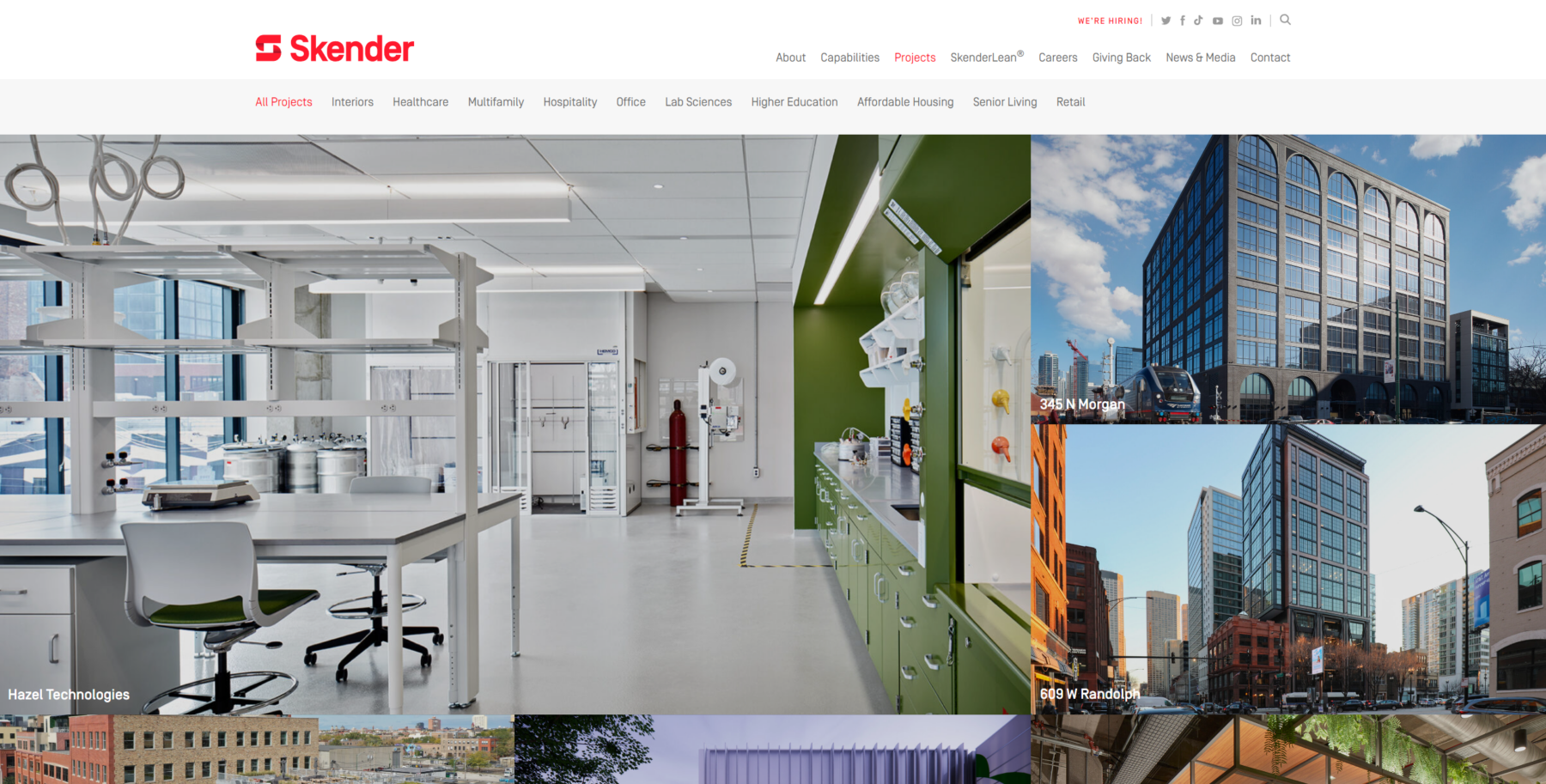
Skender expertly uses impactful text over top of imagery and their focus on SkenderLean® immediately gives the impression that it is cutting edge. The designer also cleverly used gradients to soften sharp red colours so as to not overwhelm the viewer.
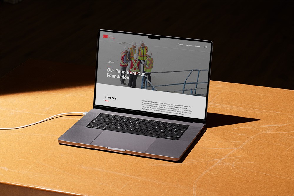
Wales McLelland
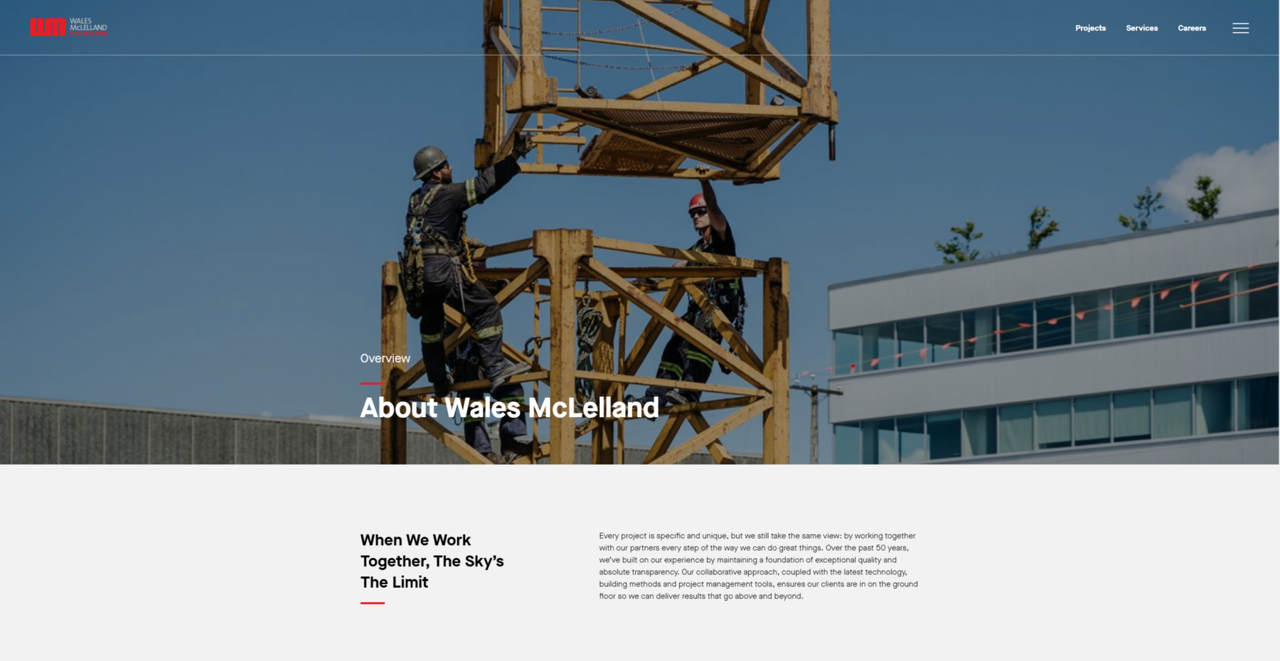
Clean, clear and concise – this site works hard to make everything easy on the eyes. The messaging and font strikes a balance between being friendly and engaging, but also still technical. The strong use of video helps tell the brand’s story throughout the site. Stats are blown up over high-quality images so visitors come away with all sorts of unexpected information nuggets.
Marcon
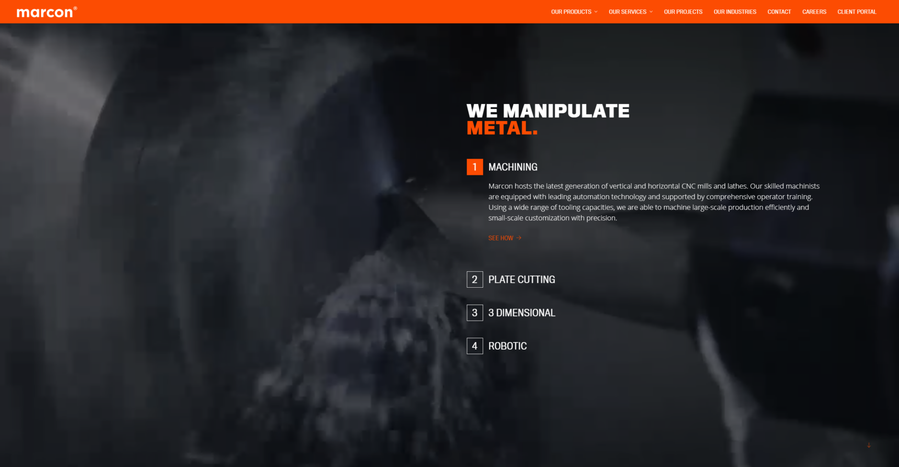
With its beautiful graphics that expand while scrolling, this site tells a visual story. The thoughtful patterned backgrounds and headers translate well and orange is used to emphasize important words. The overall quality of cutting tool videos was also high. There is something so satisfying about watching a lathe carve through a piece of metal.
PCL
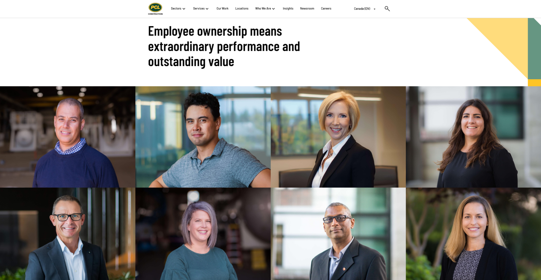
It’s no surprise that the largest builder in Canada would have a sophisticated website. Yellow and green brand artifact animations are sprinkled throughout, adding layers of branding beyond just a logo. The text is clean and concise, making good use of subheads. While the site is massive, layouts are kept simple, making it seem less daunting to navigate. While it has some flashy elements, PCL resisted the urge to go overboard.
RAM Consulting
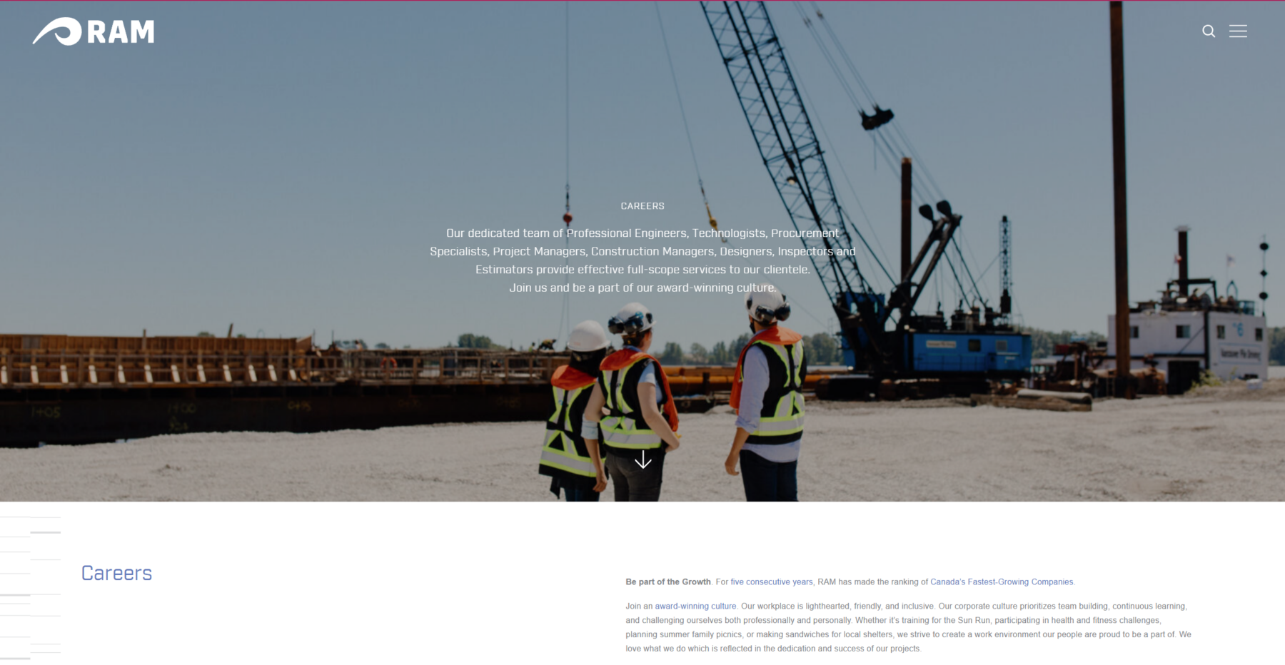
Blocky, structural, precise – RAM’s font, which sits over images, clearly communicates engineering. The design shows restraint with limited use of headers. This draws the reader into learning more rather than just quickly glancing and scrolling through. Ram also has a striking logo that they aren’t afraid to show off on a large scale.
Rize
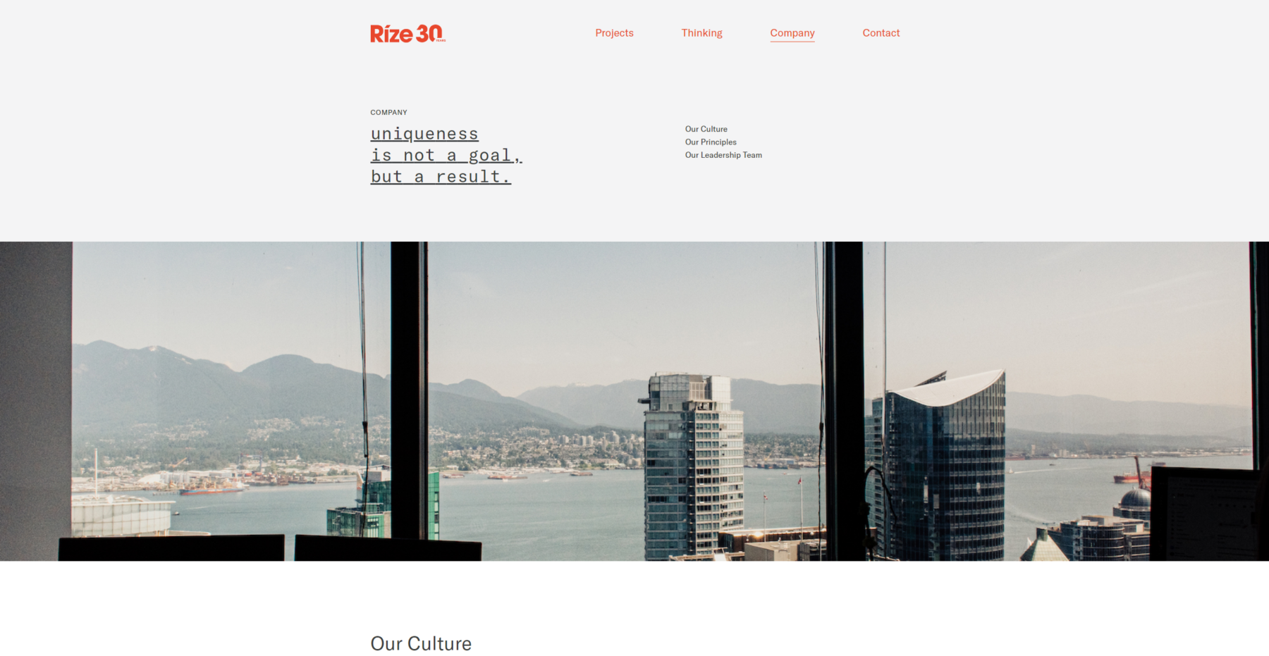
Sometimes less is more. Rize lets the viewer’s imagination fill the void by use of white space. The impactful bold use of orange permeates the whole site. And while some companies have a “blog” section, Rize blazes its own path, calling theirs “Thinking”. It’s filled with engaging articles that position the brand as a thought leader. Even the project descriptions show personality, with one reading “Hello, our first rental”.
Magil
Magil went with a crisp, clean look and nice image wipe reveals. Their icon animates behind text to give them a larger than life brand presence as you’re scrolling through. The design achieves a larger than life brand presence while scrolling as the icon animates behind text.
Anthem Properties
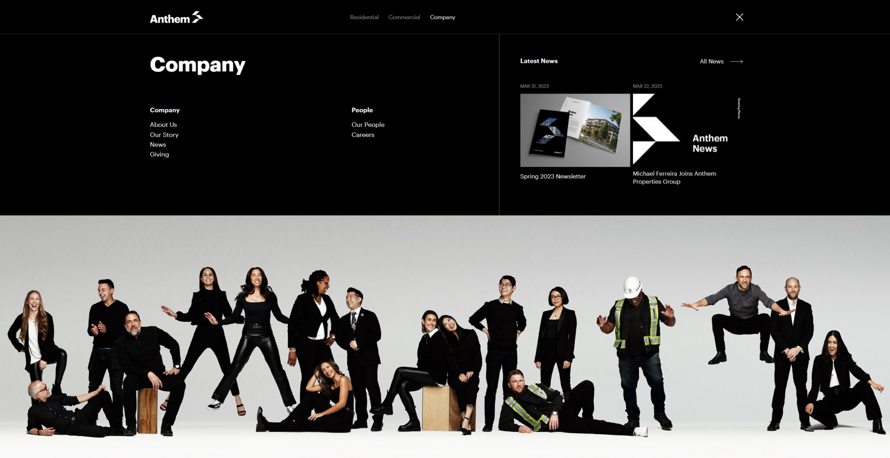
You have to admit, “Growing Places” is a killer tagline for a developer. The site features seamless scroll animations on the homepage and large, clean menus for easy navigation. Black and white branding could have been dull or overly serious. Anthem made it their own with hip curated photography of team members wearing the colours and having fun.
*Bonus websites:
Aryze
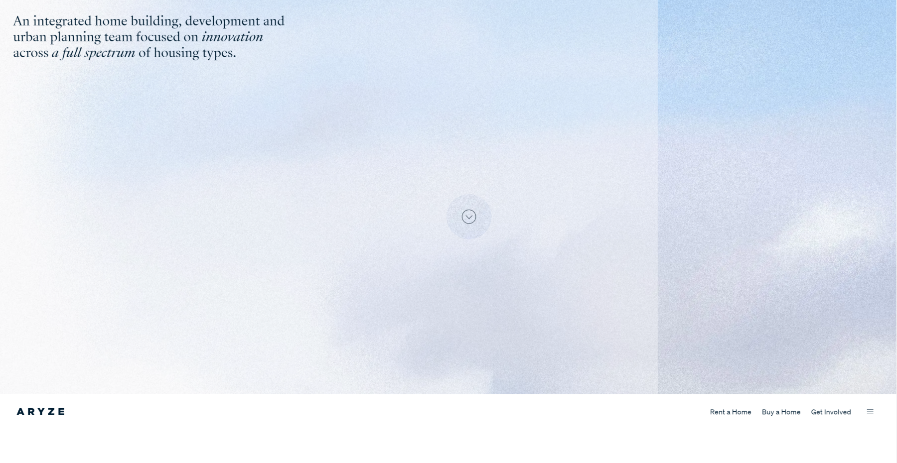
How many websites turn your mouse into a spotlight? It also features beautiful textures, super clean layouts, good use of white space and sophisticated font selections. There was a great deal of thought and intention put into this site to make the navigation pleasing and the visual hierarchy clear.